Blog Archives
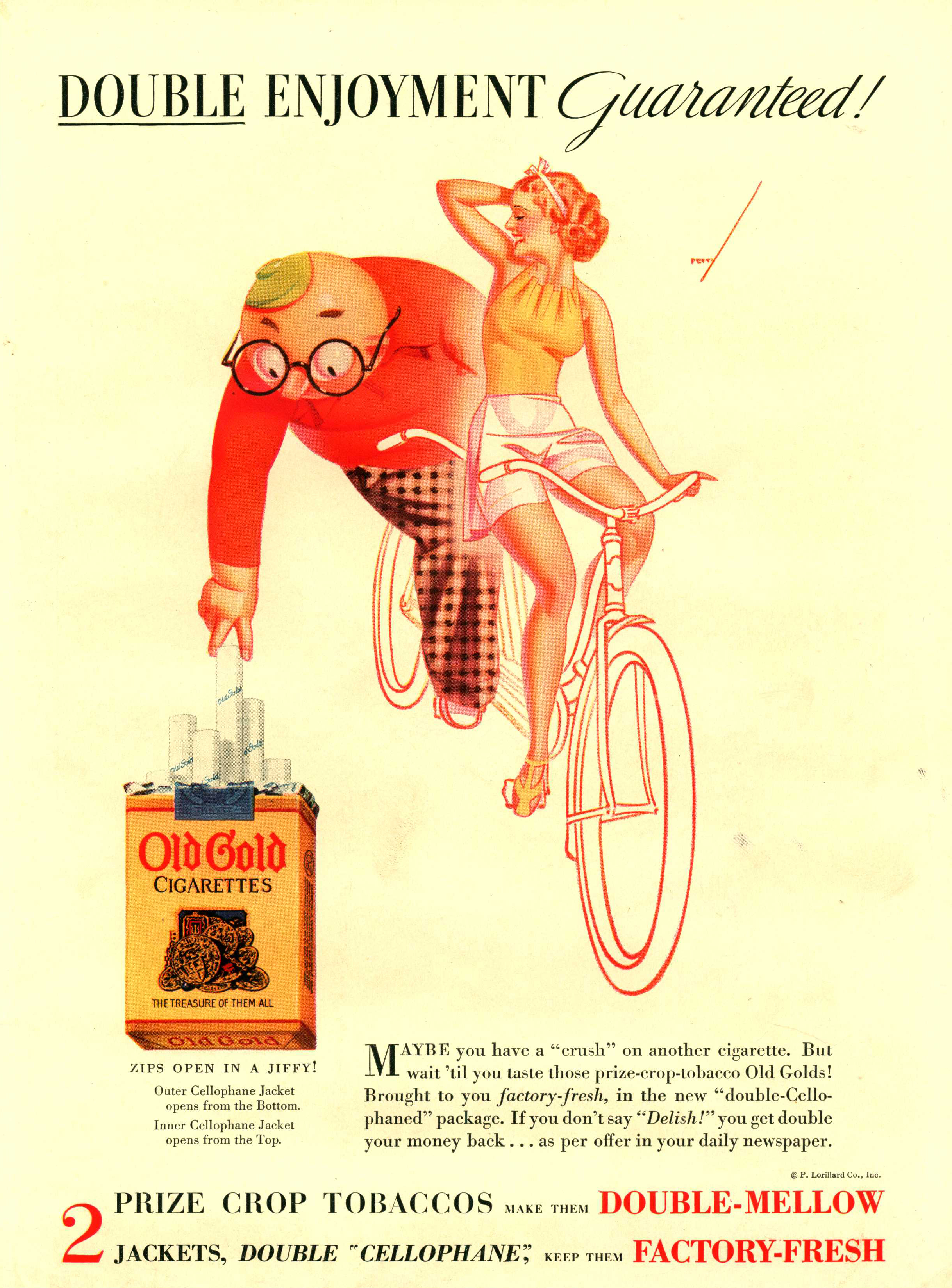
Advertising – Cigarettes
Instead of a cigarette, enjoy a small sampling from our chronological assortment of 1000’s cigarette ads, from the 1920’s till today, currently on display on the top shelf of the picture collection.
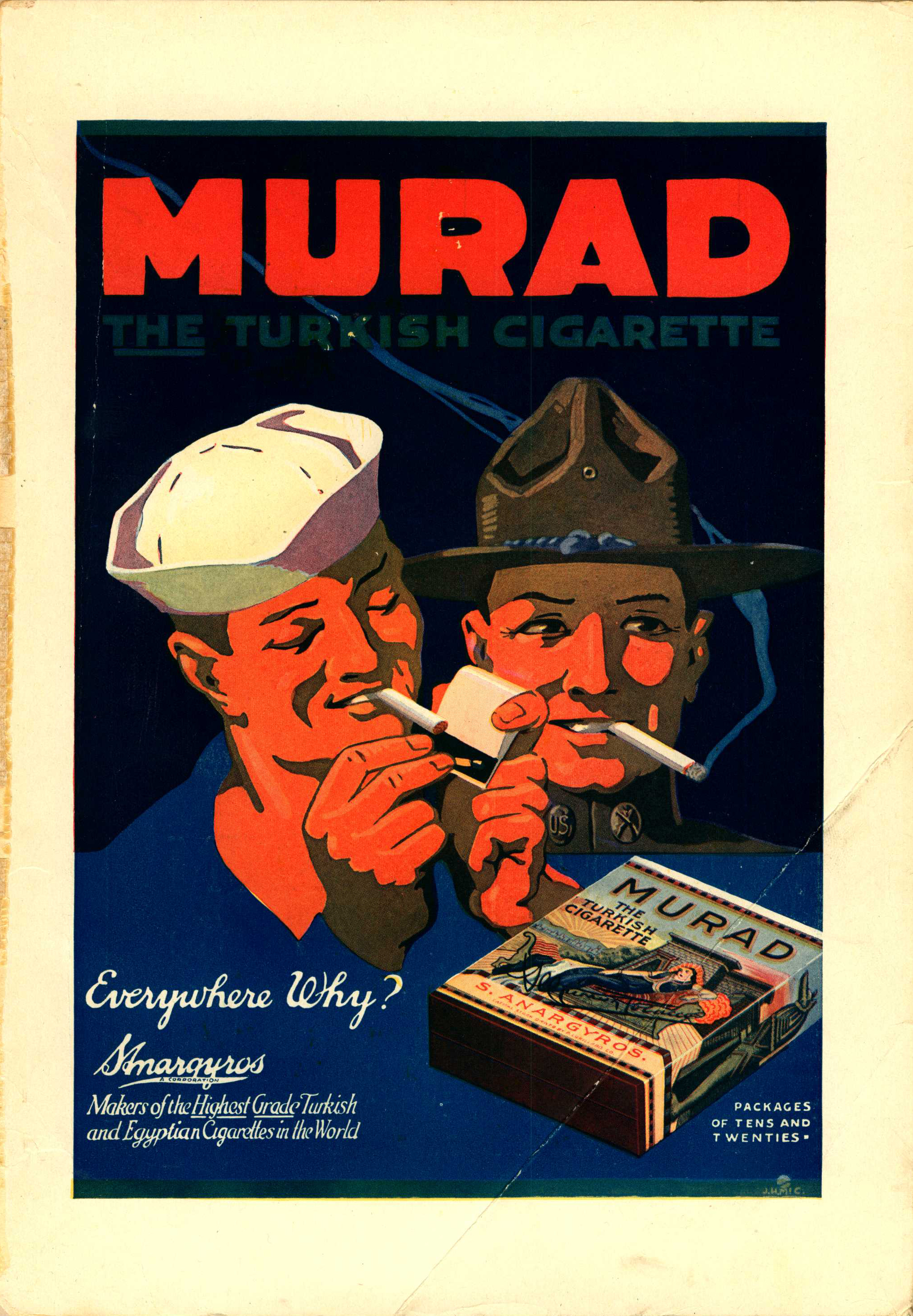
1920-1929
1930-1939

1940-1949
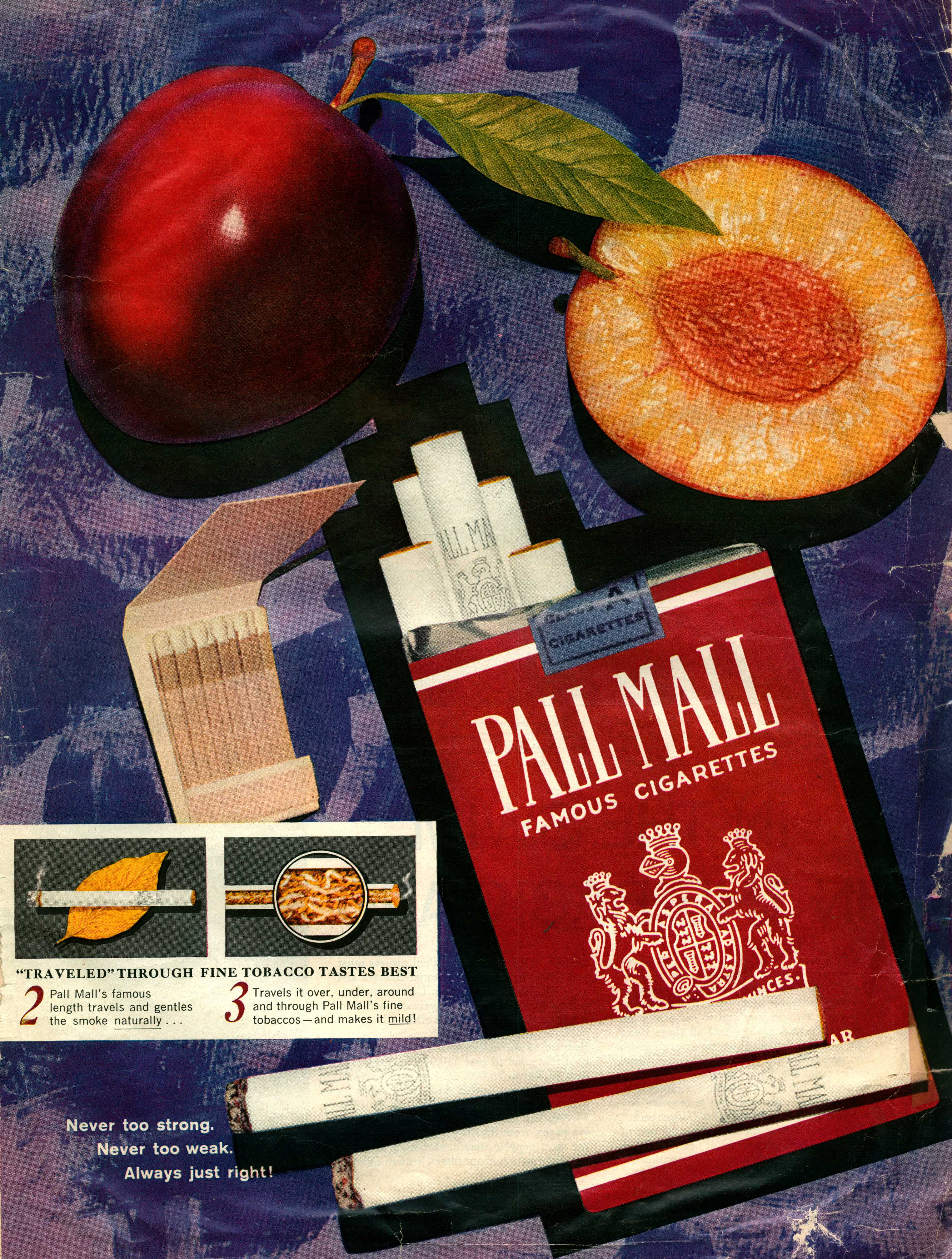
1950-1959

1960-1969

1970-1979

1980-1989
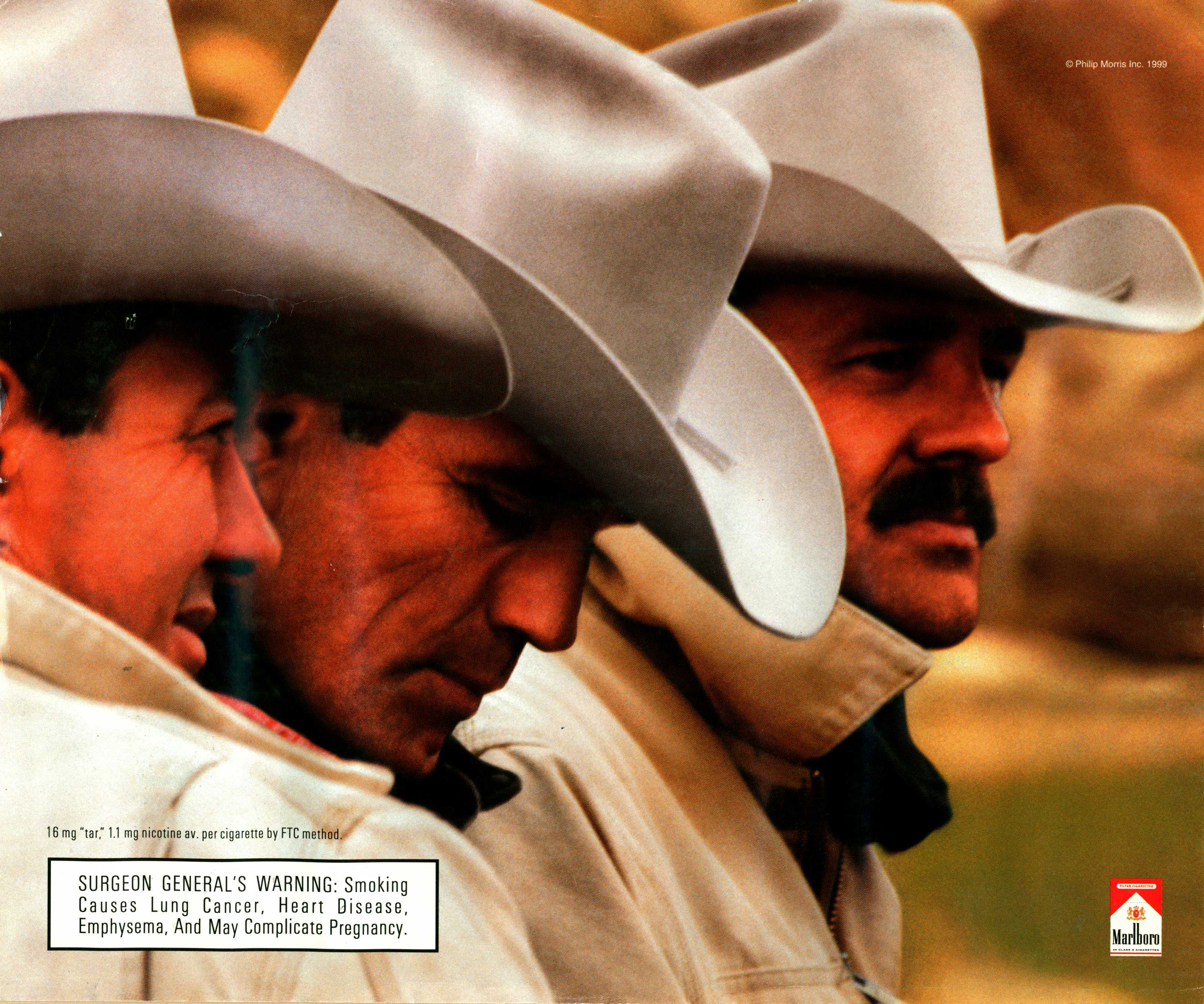
1990-1999
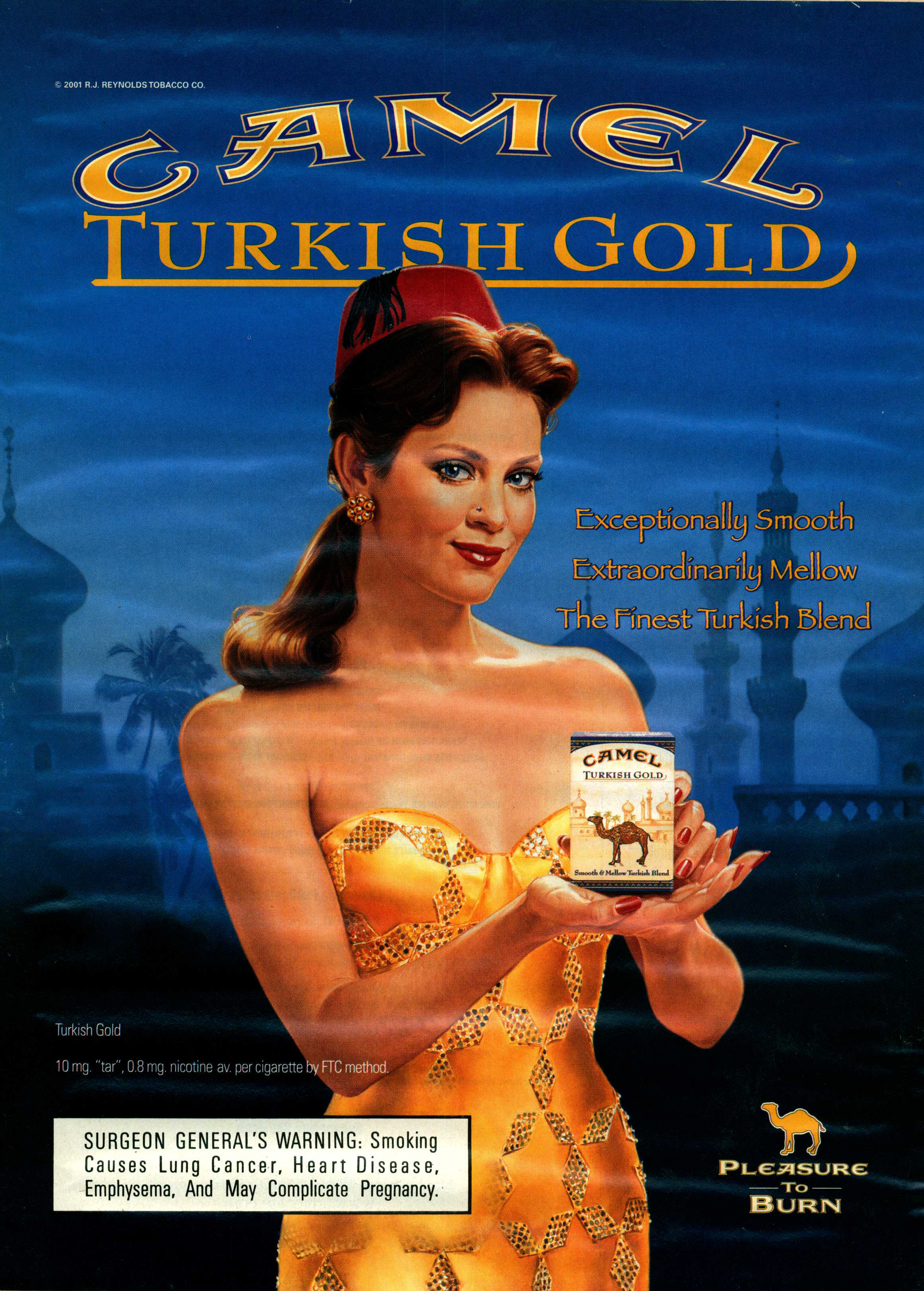
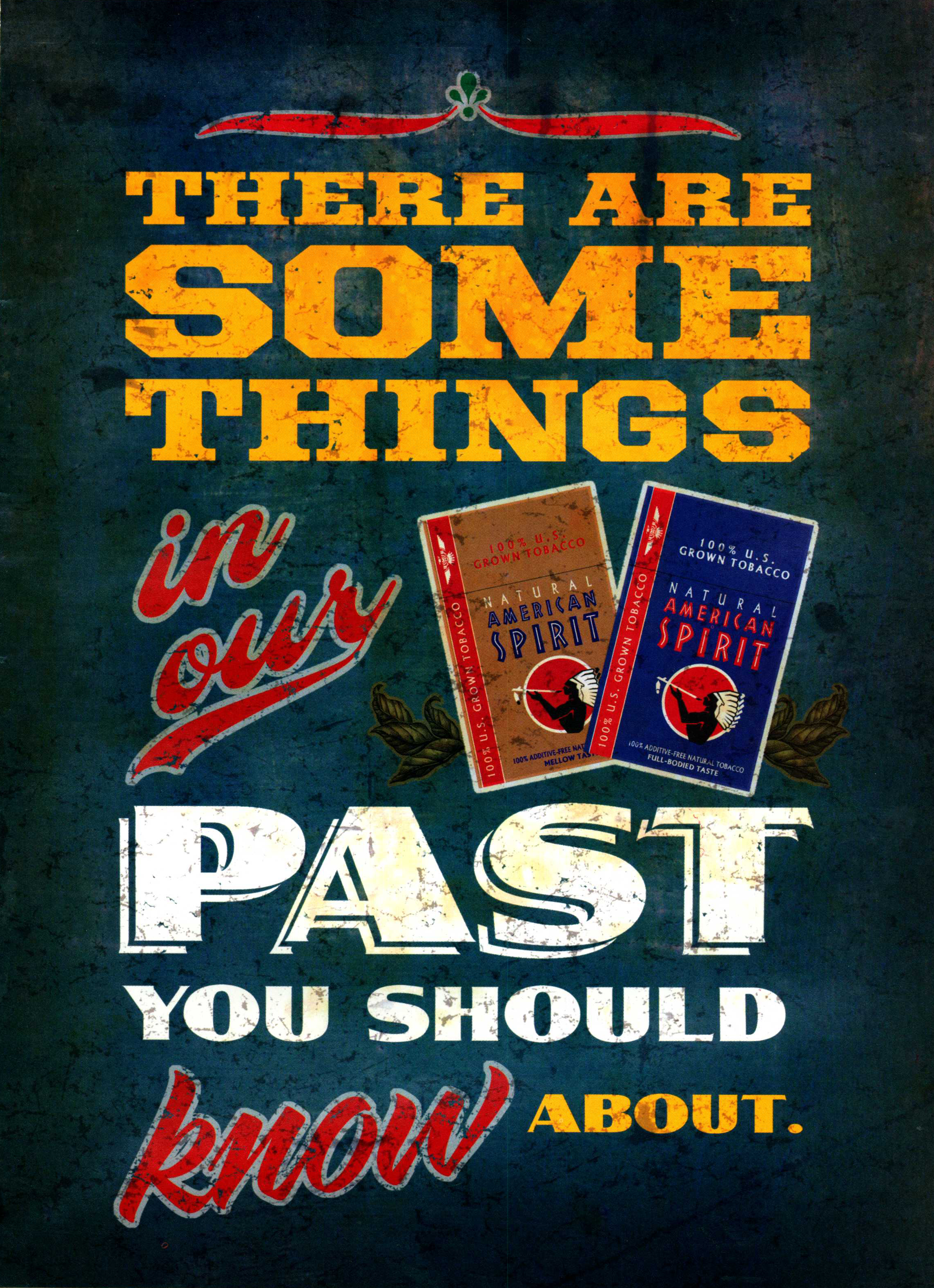
2000-2009
2010-2019
Sheet Music
Clefs and lattices of lines, notes and rests, presence and absence, signatures and articulations, the graphic art of musical notation serves as both rigid explanation and expressive abstraction. Below find samples illuminated and otherwise unadorned from our Picture Collection, ranging from the Italian Renaissance to 2006.

Medieval Sheet Music
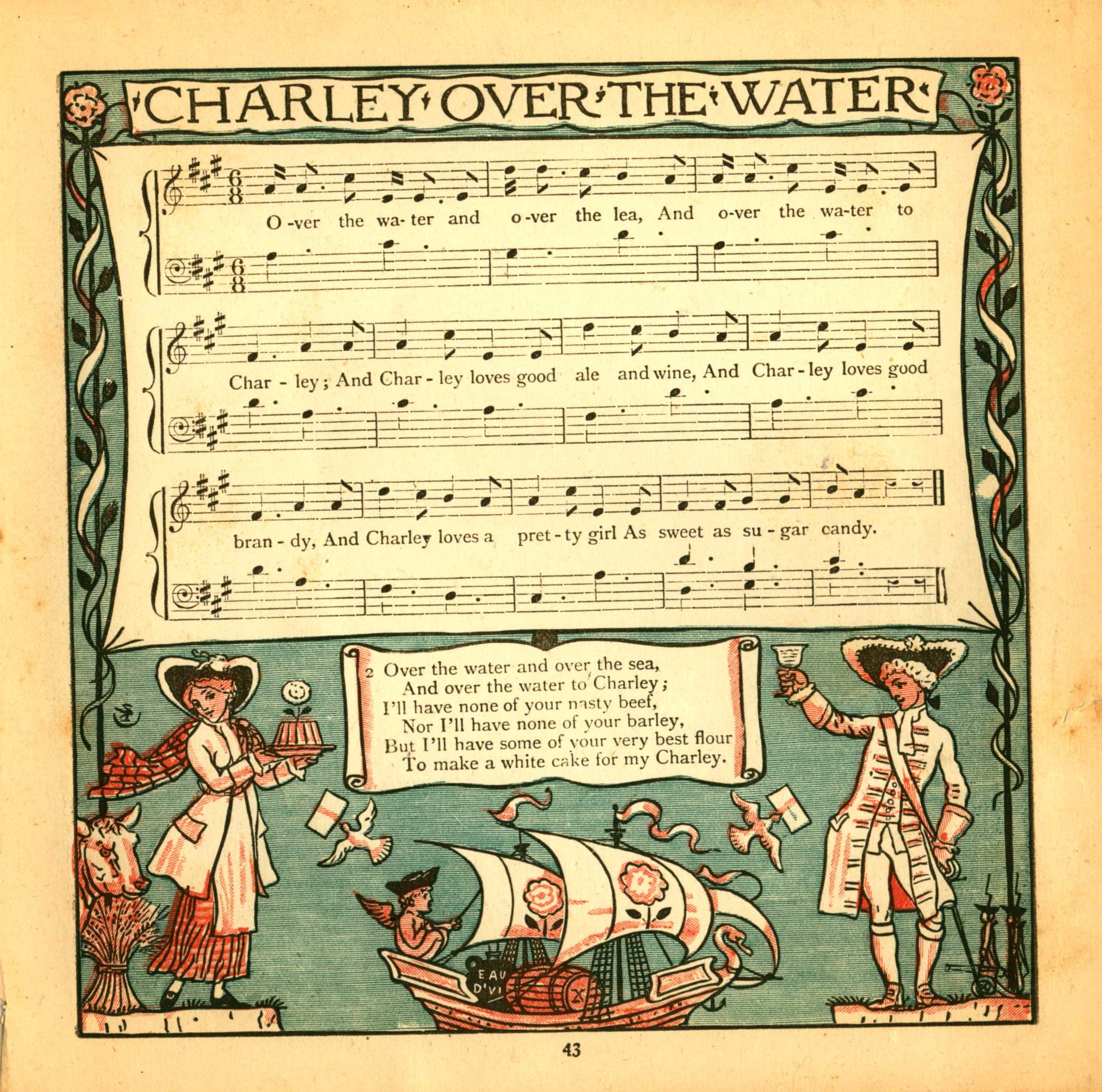
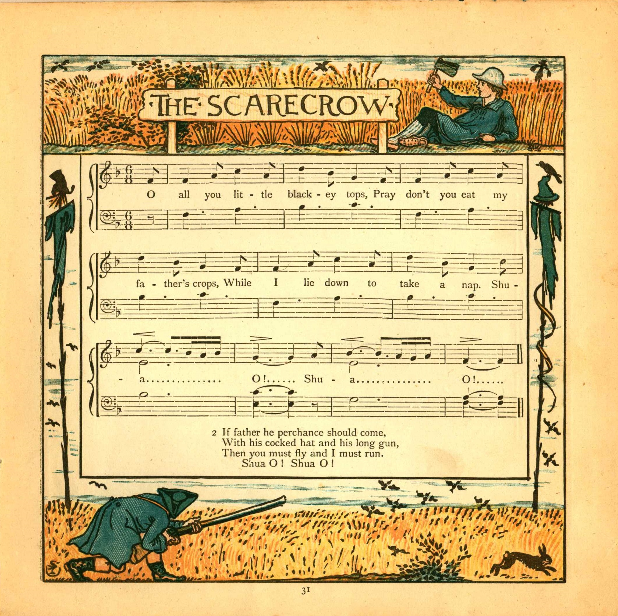
Following is a selection of sheet music from the 1879 book The Baby’s Boutique, Illustrated by Walter Crane, an influential, prolific illustrator that you can learn more about in our book stacks:


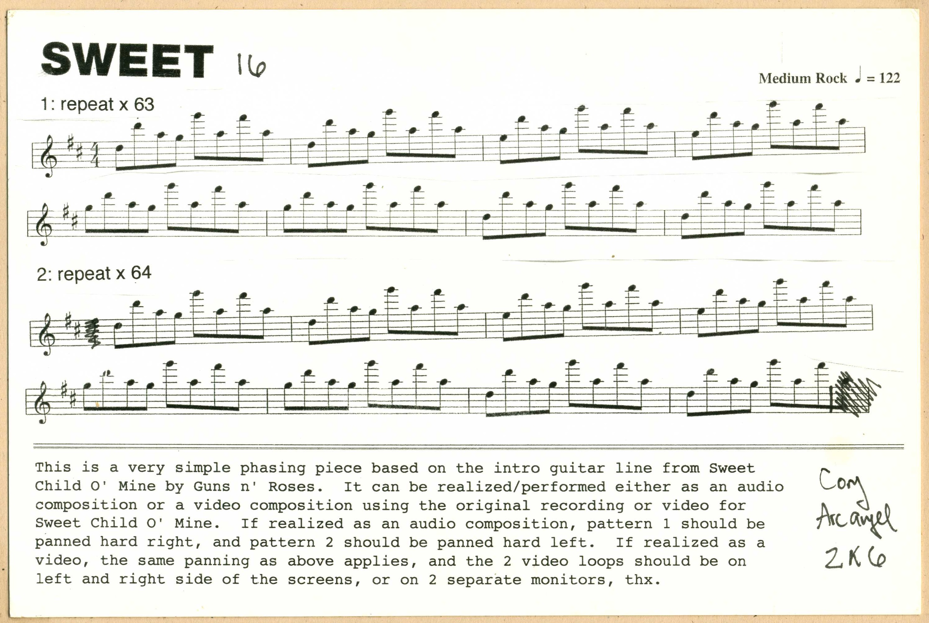
Sheet Music from a 2006 Video Art piece by Cory Arcangel.

The Etude Magazine, April 1946.
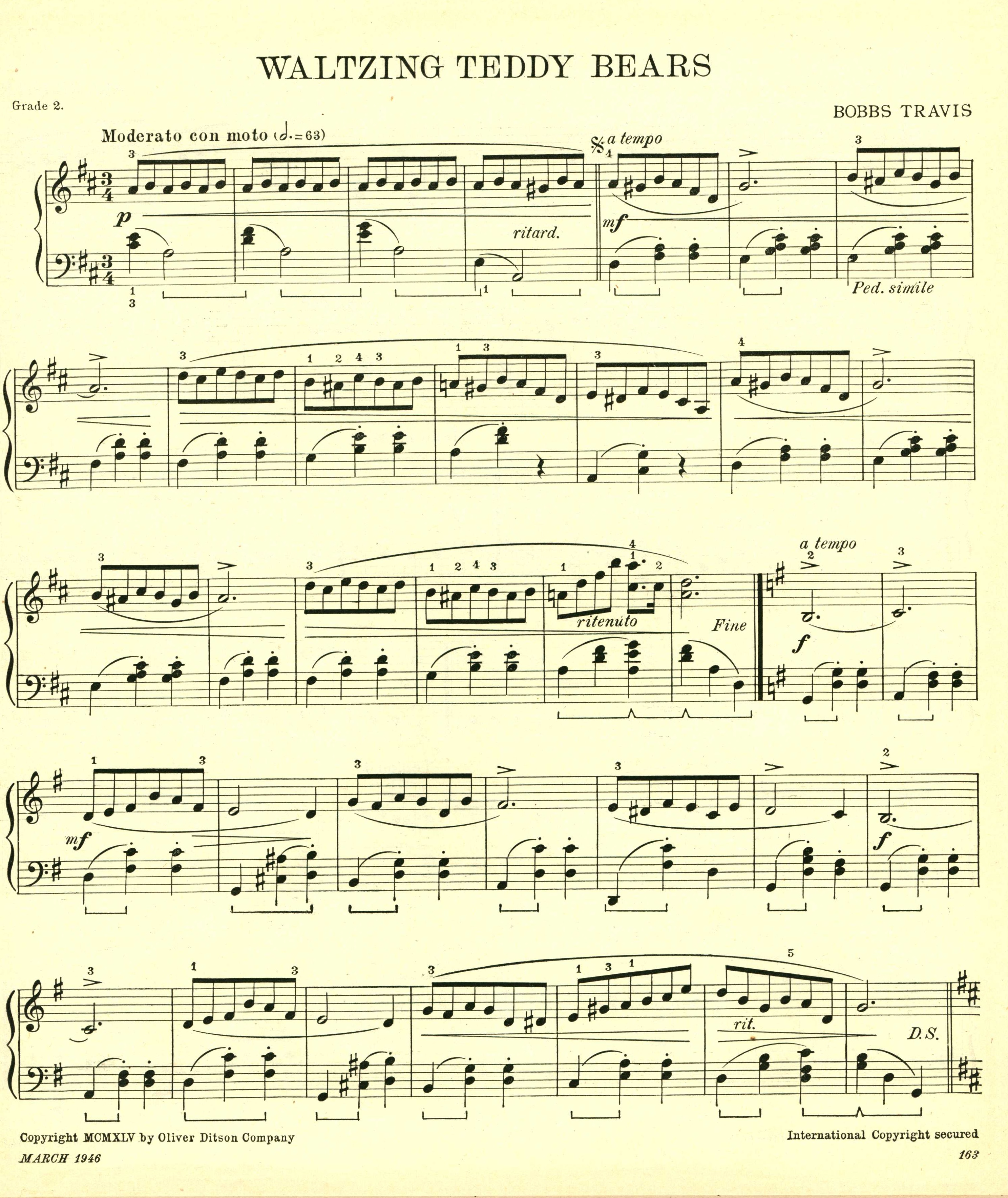
The Etude Magazine, March 1946.
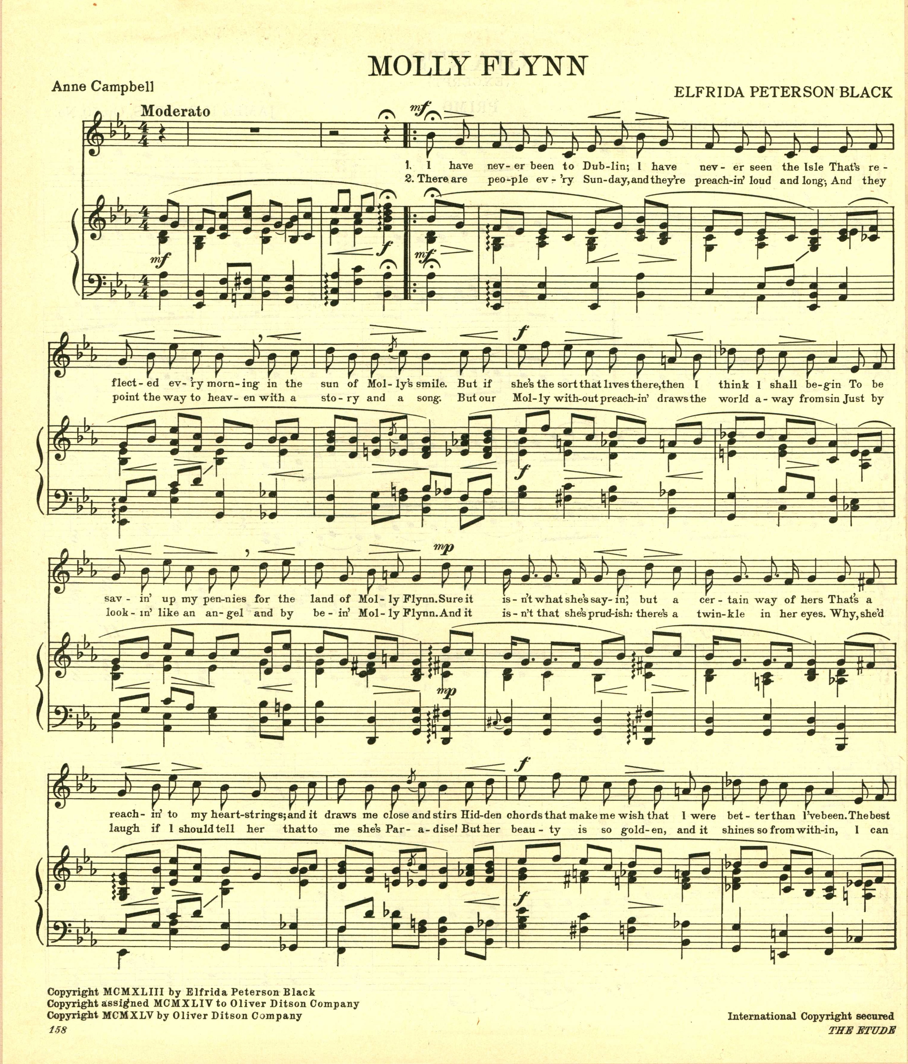
The Etude Magazine, March 1946.
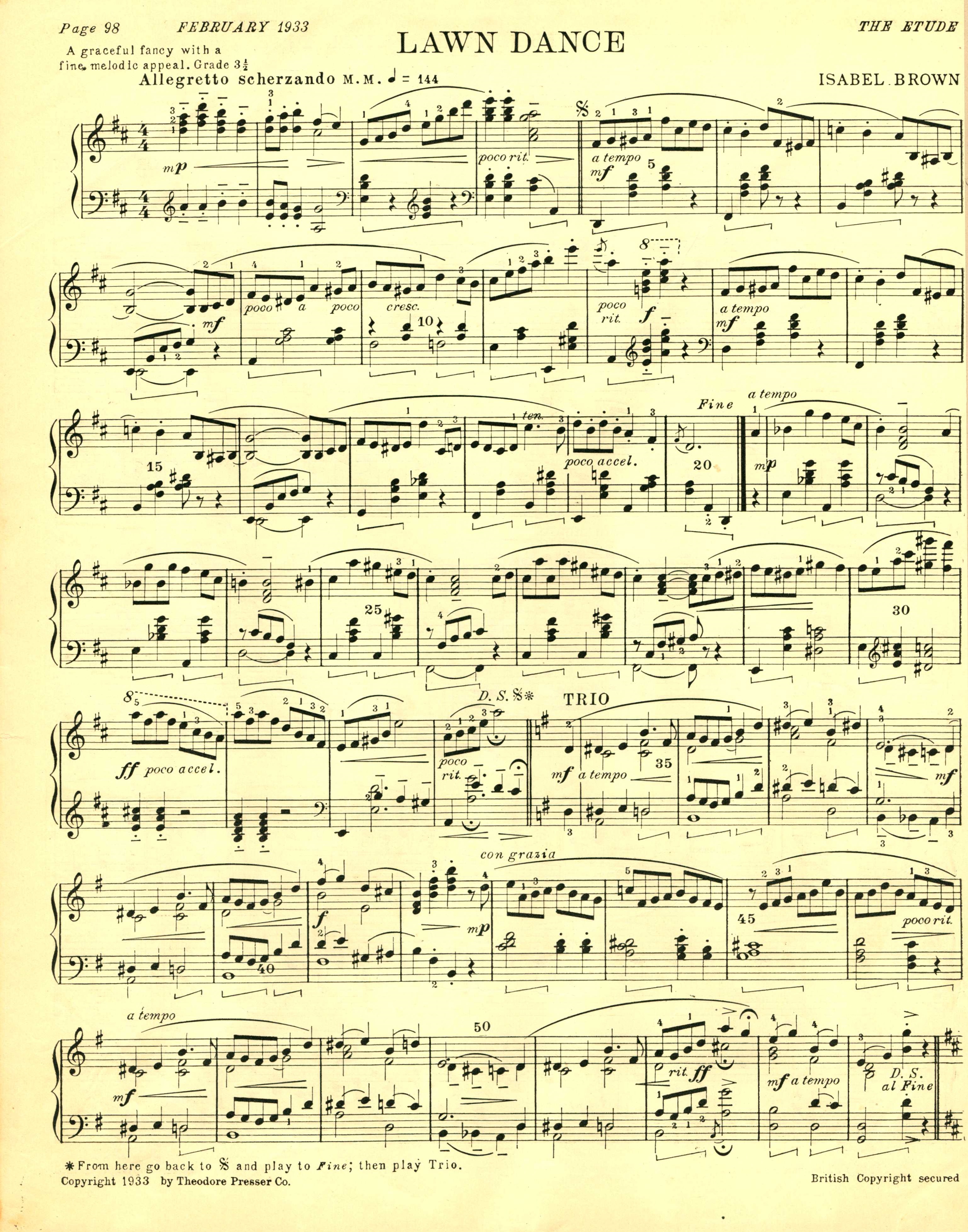
The Etude Magazine, February 1933.

The Etude magazine, January 1933
Toys – Dolls
Toys has 9 subcategories, 8 of which are chronological distinctions (pre-1950, and then by decade through the partially futuristic 2010-2019) and one of which is Dolls. Toys – Dolls contains 126 items. Here are just a few:


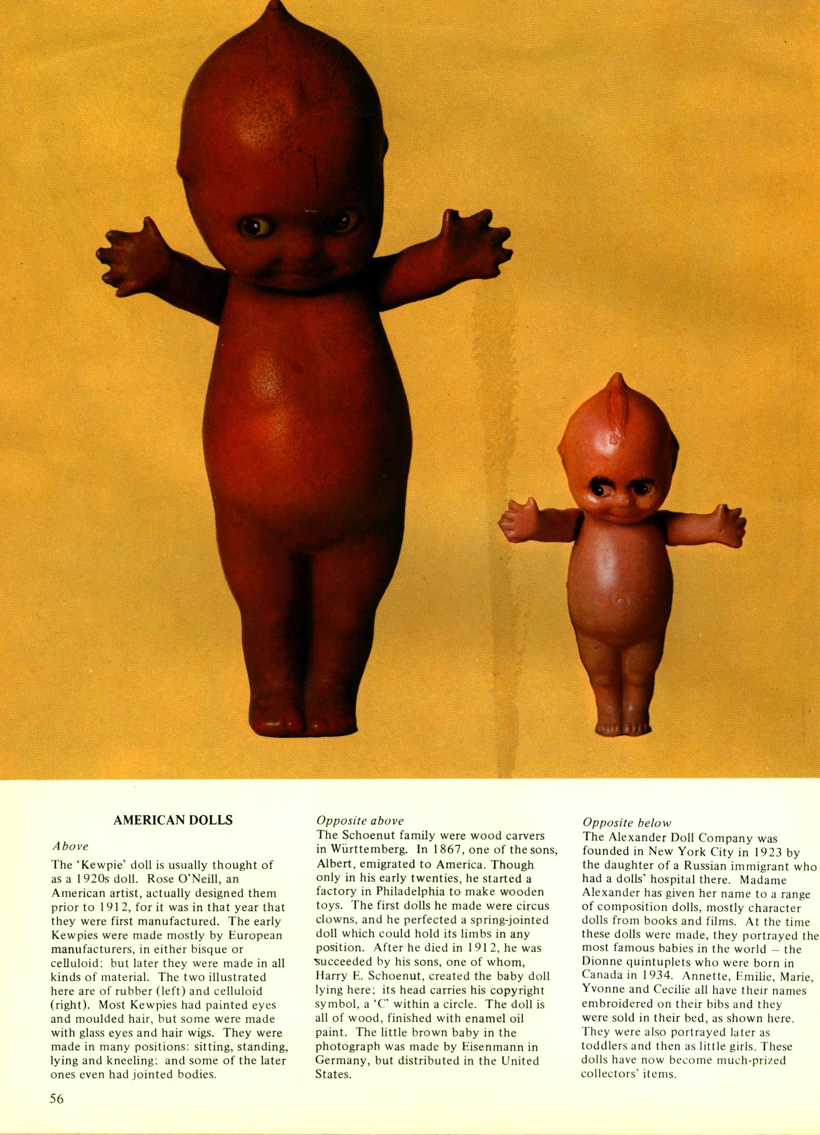
Kewpie Dolls, first manufactured in 1912.
All Color Book of Dolls, 1974 by Kay Desmonde.
Photo: Angelo Hornak

All Color Book of Dolls, 1974 by Kay Desmonde.
Photo: Angelo Hornak

1855 & 1875 Wax Dolls
All Color Book of Dolls, 1974 by Kay Desmonde.
Photo: Angelo Hornak

All Color Book of Dolls, 1974 by Kay Desmonde.
Photo: Angelo Hornak

All Color Book of Dolls, 1974 by Kay Desmonde.
Photo: Angelo Hornak
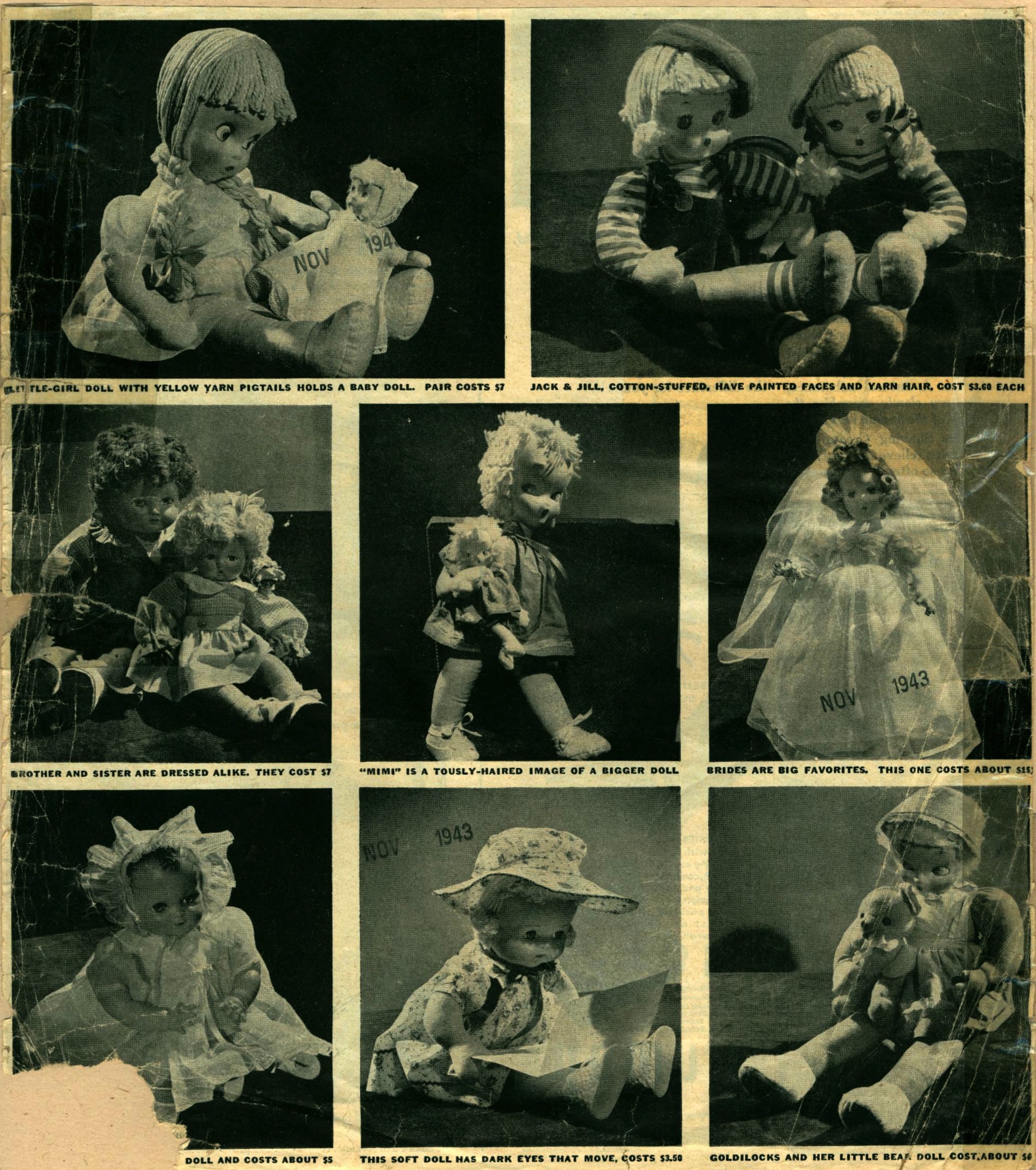
November 1943

December 1967
A doll with a doll:

All Color Book of Dolls, 1974 by Kay Desmonde.
Photo by Angelo Hornak.

November 1955

December 15, 1997.
Photo by Richard Mitchell.
The doll that encourages bullying: (“It’s easy to make her cry.”)

The dolls that are gluttons for punishment:


1990
ADVERTISING – FOOD – 1862-1939
1862-1939 is our oldest subcategory of sustenance and taste sensation advertising. Thereafter the subdivisions are broken up by decade: 1940-1949, 1950-1959, 1960-1969, 1970-1979, 1980-1989, 1990-1999, 2000-2009, 2010-2019.
It is astonishing how text heavy ads from this time period were. Only the legalese of drug advertisements warnings have as much text these day. Our oldest food ad (it’s actually a book that instructs you how to better grow food) from 1888:

From the Youth’s Companion, 1898, we have a Quaker Oats ad that pre-dates the formation of the Quaker Oats company (which formed in 1901–until that time it was called the Quaker Mill Company). We also have an ad for Beardsley’s Shredded Codfish which leverages the abstentions of lent by letting the devout know that they can still indulge in a delightful dish of fish cream and fish balls.

Also from the Youth’s Companion, 1898, is this romantic little Wheat Germ ad:

I do not have exact dates for the following four ads, but I guess they are from approximately 1900.
 Cleveland's Superior Baking Powder")
 Knox's Gelatine & Durkee's Salad Dressing")
“This four year old girl was raised entirely on Eskay’s food.” & “For Infants and Invalids.” This is so very sinister:

I am John Mackintosh the Toffee King, and just as the moon controls the tides, I control your children:
 Mackintosh's Toffee")
From 1901, this may be the ugliest ad that I have ever seen:

We have many Libby’s ad from different time periods. This one, from 1904, I believe is our oldest:

I remember deviled ham sandwiches (as if I were Joe Brainard). I didn’t care for them as a child, but I could really go for one right now. 1924:

1930’s (ca):
 Heinz Tomato Juice")
1930 era Pep cereal depicts the boy of the house usurping the man of the house (not pictured) to the great adoration of the woman of the house.
 Pep")
The bread diet, 1939!

And finally, also from 1939, a comic ad for All-Bran featuring “The Regulars” sharing a page with a fencing baby.
")
Magazine Covers — 1930-1939
From February 1930 we have some exceedingly (borderline illegible) Gothic type on an issue of Velhagen & Klasing Monatshefte. Velhagen & Klasing was a German publishing house, and this was apparently one of their journals. According to http://www.burchfreunde.de, it was some sort of catch all humanities title with poetry, fiction, art, lit criticism, & etc.. I have included a detail of the middle (because I adore it), which features some Pisces fish, a very cute cat, and an explosion of cheer.


I find the next piece to be a sophisticated little piece of design, as well as a very telling artifact from the advertising community. There is a ghostly heard of identical consumers not only in cross-hairs, but also under the auspicious gaze of a giant graphic eye.

Starting in 1896, House Beautiful is the longest running “Shelter Magazine.”

We have quite a few Etude covers, an American music magazine, but none with gypsies as well dressed as the ones featured on this October 1930 issue.

As mentioned before, we have Travel covers from several different decades. I love the flourish of the v as it “travels” to the l. And once again, the depth of color is pretty astonishing.

A very clever illustration from Vanity Fair contrasting the fat cat 1920’s with the hobo 1930’s, utilizing newspaper stock market report cutouts.

And a very stiff-jawed Katharine Hepburn. We have a number of other Vanity Fair covers, do stop in and see them.


