Category Archives: Periodicals
Features new subscriptions, recent acquisitions, dead runs of interest, and generally highlights the Visual Arts Library Periodicals Collection.
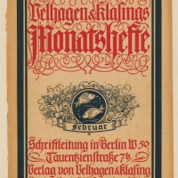
Magazine Covers — 1940-1949
Tricolor is the English language edition of La France Libre, a French anti-Nazi publication that began in 1940. Here is the first page of an article about the magazine’s origins. Below we have the cover for the celebratory July-August 1945 edition.

Surgery assistance by glowing neon letters, RN from 1943.

Free World: A Non-Partisan Magazine Devoted to the United Nations and Democracy featuring both a 1940 dominant and 1945 submissive Hitler, illustrated by Luis Quintanilla.

Here is an interesting cover from a May 1946 Interiors magazine by Bernard Rudofsky, who you can find out more about in our books stacks:
Architecture without architects, an introduction to nonpedigreed architecture.
NA2430.R8
Lessons from Bernard Rudofsky : life as a voyage

This Met bulletin cover from January 1945 features their smart little logo on the back cover, a deeply saturated blue-green background, and a detail of a painting of Henry Fredrick, Price of Wales, and Sir John Harington, by and unknown painter of the British school. Dated 1603.

1947: the year of the midriff.

Another great Nature cover, February 1949. Illustration by Frederic Sweney.

And lastly, a textured, mysterious American Artist cover from January 1949. The photo is by Telberg-von-Teleheim and is titled “Mask of a Dream.”

Magazine Covers — 1920-1929 (Part 2: Garten Schönheit)
This is a quick delve back into the 1920’s before I trundle into the 1940’s. It’s a perfect spring day in New York City, and so I feel compelled to share some of the Picture Collection’s loveliest pieces. We have all 12 months of Garten Schönheit from 1922. Each cover of this monthly magazine features a fantastic floral themed, late Art Nouveau illustration. Also, notice how from month to month, and season to season, the illustration behind the title changes, beginning with a brown root system in January, and progressing through color and leaf, flower and fruit. Enjoy.


Magazine Covers — 1920-1929
We continue our delve into our deep folders of Magazine Covers. It is ever so hard to pick just a few to show you from each decade, but I hope this sampling entices you to come in and see more in person. Please enjoy these richly illustrated gems!
La Science et la Vie started in 1913 and persists to this day (but is now just called Science & Vie). We have dozens of these—all richly printed with illustrations depicting all the wonderful possibilities of industry, technology, and all things grand through science!


Illustrirte Zeitung was apparently Germany’s first illustrated magazine, published by J.J. Weber in Leipzig in 1843. As we learned from Steven Heller concerning “Das Plakat, Germany had a leg up on graphic design in the early 20th Century. You can also learn a bit more about Illustrirte Zeitung here.


We have several covers of Nature Magazine from the 1920’s. Vintage wildlife motifs, inspired by covers like these, have been very popular in home design for a number of years now, like in the work of John Derian.

I took this information from an auction website:
Shadowland, a magazine published in the late 1910s and 1920s, which billed itself as “Expressing the Arts”, and “The Magazine of Magazines”. Each issue had a variety of articles about various aspects of the arts, and each issue had at least one story dealing with movies. The articles were heavily illustrated with quality sepia photos by named photographers (who are credited next to the photos), and the entire magazine has a feel similar to that of “The New Yorker”, except of course that it solely focuses on the arts, and has many illustrations throughout. There are a few interior color pages in each issue and a few ads scattered through each issue. The magazine was published by the same people who published Motion Picture magazine. (http://auctions.emovieposter.com/Bidding.taf?_function=detail&Auction_uid1=1937319 accessed 4/26/2011).

And lastly, Travel magazine, another title we have dozens of examples of from multiple decades. The printing color is exuberantly rich. Come to the Picture Collection and see more!

Magazine Covers–Pre-1920–Part 2 (Das Plakat)
Das Plakat, a German magazine, began in 1910 as an extension of Verein der Plakat Freunde (The Society for Friends of the Poster). Everything I know about Das Plakat I learned from an article by SVA’s own Steven Heller that he wrote for designtaxi.com. Read it now, and become illuminated!
We only have one proper cover of Das Plakat (Plakat means poster), a striking gold-metallic number from May 1914. The issue was devoted to European poster stamps.

The other items we have are not magazine covers, rather they are interior pages from various issues 1913-1915 (though I have decided they should live in the Magazine Covers folder so users can consider them together). Examples follow:

The next two pages feature works by Austrian painter, draftsman, illustrator, commercial graphic artist, typographer and writer Julius Klinger:

 Julius Klinger in our book stacks:

|
|||||||||||||
Next is a poster advertising a Schützenfest (target shooting party) by Richard Schaupp:

And lastly the title page from the January 05, 1914 edition:

Movie: “Reasoned Disagreement About Films in Britian”

Sometimes understatement and subtlety can backfire, especially when it is used for something as permanently identifying as a periodical’s title. Apparently referring to the word ‘film,’ V.F. Perkins wrote in a tribute to Ian Cameron (Cameron was the founder, designer and editor of Movie and Perkins an associate editor) that “the vulgar Americanism of the word gave it shock value and a pronounced identity.” Maybe that was true in 1960’s Oxford, England, but these days it’s just a really generic name that easily gets lost in our vast information shuffle. But it shouldn’t. Movie is a wonderful film magazine that took its cue and influence from the French Cahiers du cinéma.

Left: Back cover of issue 2, Blake Edward’s EXPERIMENT IN TERROR. Right: Front cover if issue 3, Emmanuele Riva in THERESE DESQUEYROUX
For Movie, criticism stems from, and is the logical conclusion of, the fanaticism that the writers and editors share for film. They write about movies and directors that they are really passionate about. They have a pluralistic philosophy when it comes to criticism. Much of the motivation for starting the magazine was the disenchantment they felt for established film criticism, which they felt tried to insinuate that there is one official stance when it comes to films and filmmakers. In the opening editorial of issue #1 (June 1962) they proclaimed “there is no point in replacing one cult with another. Instead we would like films to be the subject of enthusiastic argument in which our approach would only be one of many.” Despite all this, Movie had some very specific ideas about what is good and what is less so, as demonstrated in this histogram (also from issue #1):

As you can see it’s a list of directors, not writers, actors, producers, or cinematographers. Movie was interested (in the least) with the Auteur Theory of film criticism. First written about in a 1954 article by Francois Truffaut in Cahiers du cinéma, the Auteur Theory asserts that the director is (or should be) considered the author of a film. There is a nice little history of the theory by Donald E. Staples in Cinema Journal, Vol. 6, (1966 – 1967), pp. 1-7 (which you can access through JSTOR).

Left: The four stars of “Jumbo” Right: Mylene Demongeot in Michel Deville’s “A cause, a cause d’une femme”

You can find Movie in our back periodical stacks (dial M for Movie). Over it’s history the publication frequency was erratic, punctuated by frequent hiatuses, but they persisted for 29 years. We have 28 years: no.1(1962:June)-no.34/35(1990:Winter) (I believe they ceased publication with no.36 in 1991). If you take some time to read the densely packed, but artfully designed issues, you will find in-depth interviews with a vast array of filmmakers, and gobs of writing on closely analyzed moving images captured on celluloid. Ian Cameron was a well respected film critic, who apart from having this lovely mag as his periodic child, also wrote many books on film and helped England catch up with the (at the time) more cutting edge France and even the USA. It is a rich addition to our periodical collection. I’ll leave you with a couple more images from the magazine:

Right: Nagisa Oshim’s “The Hanging” Left: Sterling Hayden in Ruy Guerra’s “Sweet Hunters”