Charts, Graphs, & Diagrams
Currently containing about 100 item, Charts, Graphs, & Diagrams is one of the Picture Collection’s newer categories. Like Advertising – Corporate Identity, Industry, & Utility, the content of this category owes a great deal to late 1940’s and early 1950’s Fortune Magazines. In the future, if this category grows like a good category should, I will probably see fit to cull Diagrams into its own category . I have already divided this post, presenting first a few charts and graphs and the diagrams after.
The Visual Display of Quantitative Information, a chart or graph utilizes some sort of axis or axes, often horizontal and vertical, and reveals its information by specific plots or points and their relationship to the value established by the axes and to each other. The terms chart and graph are apparently interchangeable, but I tend to think of charts as more in the map family (of which the Picture Collection has an extensive collection) and graphs as more of the where z meets x and y variety. Regardless, charts, graphs, and diagrams all fall under the greater heading of information design. If you are interested in learning more about information design, take a look at Visual Art Library librarian Amos Turner’s LibGuide which will guide you to a bevy of resources on the subject.
Given the proliferation of PowerPoint and all of its default this, auto content that, it’s easy to forget that charts and graphs are often elegant, artistic, compositionally savvy illustrations.
Even this arcane brown-scale graph, with its clean lines and geometric intersections, is very nice to look at.
Here are a couple of graphs with language out of a Philip Levine poem, with its smelter gasses and pyrites of the heart.
A 1951 org chart in the style of Tim Burton:
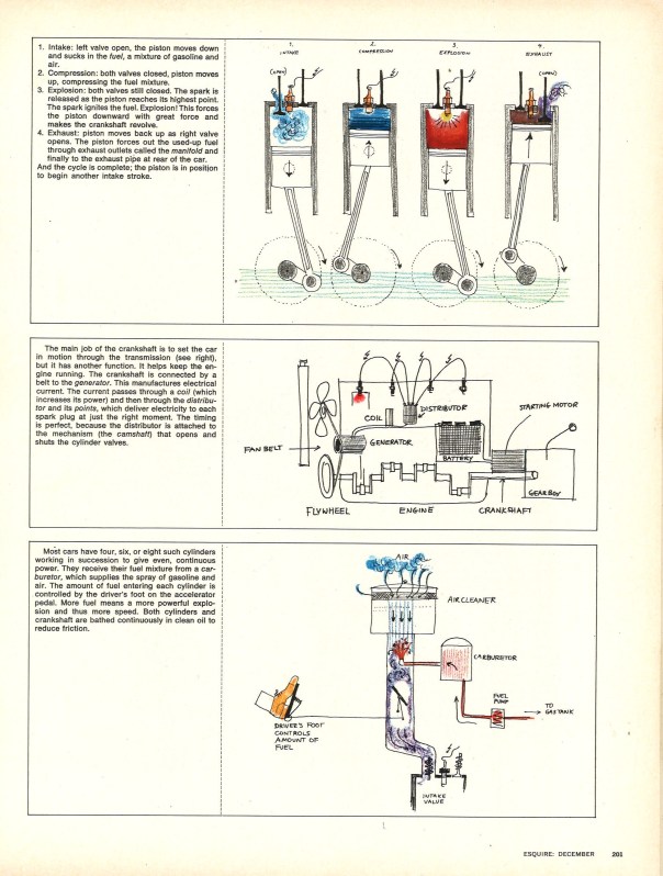
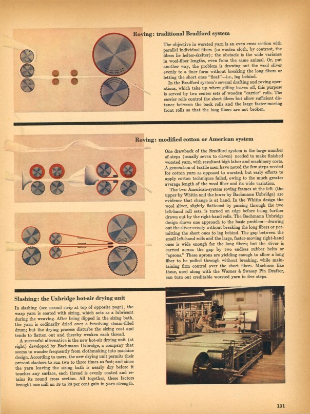
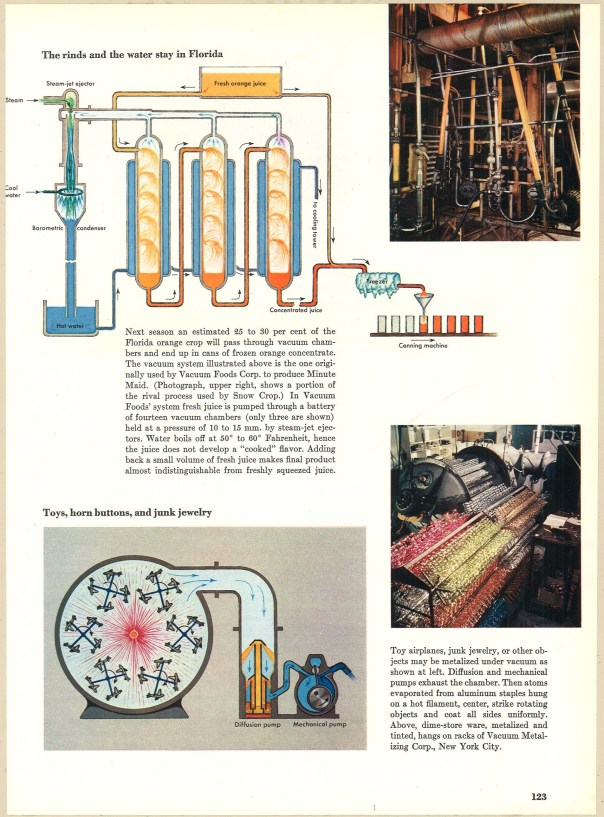
And now the diagrams.
I thought these last diagrams were interesting, especially the bottom one which depicts a contraption which “metalize(s)…toy airplanes, junk jewelry” and the like to be sold in dime stores. Despite the unromantic process, the output, detailed below, looks magical.
Posted on February 3, 2012, in Graphic Design, Illustration, Picture Collection and tagged 1940's, 1950's, charts, diagrams, fortune magazine, graphs, information design, visual display of quantitive information. Bookmark the permalink. 7 Comments.


Pingback: Charts, Graphs, & Diagrams | Visual Arts Library Picture Collection Database
Pingback: Vintage Infodesign [87] | Visual Loop
Pingback: Vintage Infodesign [87] - sqoops
Pingback: Vintage Infodesign [88] | Visual Loop
Pingback: Vintage Infodesign [89] | Visual Loop
Pingback: Vintage Infodesign [89] | Visual Loop
Pingback: Vintage Infodesign [87] | Visual Loop